Friday 10 June 2016

Final Images


Images I chose for my final images:

"One View"

The photographs I chose out of my shoot for my final images are the ones below. I recreated some of the poses from the test shoot, to get some close ups and try get some body parts close up. I really like the feel of the images with certain parts illuminated and the shadows encroaching the rest of the image. The shadows being the blanket of comfort which is used to conceal herself from the world, showing only parts of herself she wants you to see.


My images are quite still dark i wanted them a little more highlighted than what they are, so I'm going to edit them in photoshop with basic edits of levels and curves. I want to then increase the contrast to boost the high lights further. 


I'm pleased with outcome of the images I feel the edited ones with the highlights emphasised works better than the darker images. This style of portraiture is different from what I normally produced and was out my comfort zone, but I don't feel as though I achieved the best I possibly could have. I think my composition and framing has progressed massive amounts and I happy with how they have come out. But it's the lighting side of things I think I could have pushed a little more to achieve what I wanted in camera rather than having to correct it in photoshop. The close up of the foot is my favourite and I think for this collection I should of either focused on the close ups of different areas of the body almost abstract, or kept it to the parts of her coming out the shadows. I could have even tried more personal shots coming more into the model, shots coming out the frame I feel these could have worked well too. I feel this body of work is a good set but could be improved, the narrative is there but I don't think I nailed it completely. Defiantly want to carry on with this series and take it further to progress as I feel this could be bigger and better. Displaying these images I want them A2, looking around the exhibitions the larger displayed pieces are more eye catching. I would like to impact on this and create the same sense of wowness for my viewers. 

On reflection of the images I have decided not to exhibit the above images but use my images I have produced for my online portfolio Behance. I feel these images show a more creative side of my photography. The collection of images produced for my Behance account I feel work together as a body of work than the above images. These go rather well as a show piece and I feel more comfortable and proud to show the alternative images as my exhibition piece. The narrative is still based on identity but without the darkness, adults/children in today's society hide themselves away through insecurities and paranoia. Some have problems with themselves and body so put a front on to the rest of the world, they mask who they are. Using my children as the models is a bit of a contrast of the narrative as the connotations with children are innocence, adorable, confident, and happy. But in reality children this young are known to have he insecurities and anxiety which is really sad. I named my series "Obscured" as the identity is not clear this is shown with the water and milk obscuring the face. Using my 50mm prime lens on F1.8 it gives a really soft depth of field focusing on only parts of the image, this links in with the narrative as you blur the pieces of yourself to society showing only what you want them to see.

My images I'm going to exhibit: 


For the exhibition you need to provide an exhibtion label to go alongside your work, this details the title of your work, year it was created, the photographer, the size of the exhibited pieces, and also if its colour, black and white, film etc.  Then just add a short blurb to give the viewer the insight to the narrative behind your piece of work.

Leonie Lamb

“Obscured”


2016

A2 Matte Printed

Black & white


This collection of work is based on identity, using water, milk and a glass screen to create the portraits. My pieces of work portray a mask that individuals put on. This mask is used to hide their true identities, a smokescreen of their insecurities and paranoia.

Thursday 9 June 2016

Nottingham Contemporary - Alien Encounters


Sun Ra Exhibition


Sun Ra Arkestra

Sun Ra (1914-1993): The Cosmo Man 
This is the first exhibition in the UK devoted to the work of Sun Ra, the legendary jazz musician and Afro-Futurist. It aims to present him as a “total artist”. Besides his compositions, recordings and concerts, Sun Ra was a writer, philosopher and poet. He also designed his Arkestra’s record covers and publicity, and conceived and starred in a feature film, Space Is the Place (1974). Sun Ra took the name of the Egyptian sun god and claimed to have come from Saturn. The exhibition is designed by leading French scenographer Nadia Lauro.


Rana Hamadeh: The Fugitive Image
Rana Hamadeh presents The Fugitive Image, the latest chapter of her long-term project Alien Encounters, for this, her first solo exhibition in the UK. The original impetus for her Alien Encounters series was Sun Ra’s film Space Is the Place. Her sculptural installations, exhibitions, and lecture-performances explore the idea of being alien as a way to address urgent issues in the Arab and wider world today. Hamadeh revisits the story of the infamous serial killer sisters Raya and Sakina, the first women to be sentenced to death by a legal court in the modern history of Egypt.


https://www.youtube.com/watch?v=rgLWXlE8KPU
18.03.2016

This exhibition being my first ever was really weird, and I didn't quite understand the concept behind most of the exhibits. I suppose I was more taken with the display of the different sections, it allowed me to open up to the possibilities of presenting my own work in different ways. I didn't particularly like the exhibition I think mainly because I didn't quite get what it was about.

Test Shoot for Final Images

 Contact Sheet for Test Shoot: 


This was my test shoot done for my end of year show, my idea was to get parts of the body lit with the shadows taking over the rest of the body. I did some shots close up of the face feet legs with some fuller shots of the body. I shot in raw this is why the images are in colour, but for editing I want them to be in black and white. Setting up the shoot I used a black backdrop with the one main light and had barn doors attached to direct the light where I wanted. Using the barn doors helped direct the flow of the light without light spilling on to the whole sceen. I had the modelling set without flash as this was adequate to style of light I required. My back drop was placed against my patio doors which let daylight through the back drop. It is only made out of muslim cloth so I had to use some black out curtain behind and tape them to the walls to hide the access light. The images are quite dark my ISO was on 200 and shutter speed 1/60 sec using my 50mm prime lens, the images could of been better exposed by upping my ISO, lowering my shutter speed would have caused the images to show movement and blur so that wouldnt of worked. I could of tried turning the intensity of my lamp up also. For my final images I want to edit them black and white and have them high contrast, so the highlighted parts stand out. On doing my next shoot I want to concentrate on some pacific poses the model did, I want to bring them out of the image. 


Friday 6 May 2016

PRESENTATION OF FINAL IDEA & HOW THIS HAS PROGRESSED

Hidden Identity:

My passion is portraiture, mainly photographing children the reason for this is you as a photographer get to capture their essence. Children are natural, young, carefree and don't try to force expressions or emotions unlike adults, who force their smile for the portraits. They force something to how they think the perfect image is. This is one reason I prefer to photograph children. But... for this particular project I have changed my mind to go with using adults as my models. And also move away from my traditional approach to portrait photography. 

What does my idea communicate? What has changed in regards to my idea? 

My idea has changed slightly from my initial learning agreement, but still has the style and technique there which I had in the beginning. I will be still producing black & white, low key images using one main light. Choosing to do black & white, low key photographs I'm almost hiding the identity and taking away the smile. Using adults seemed more fitting than photographing children, trying to use kids would be like taking their innocence out of the image. By only using one light and lighting only parts of the image, wouldn't be as effective as using an adult. Most adults these days live their lives by hiding who they really are or trying to be someone/ something they are not. So by creating these dark low key images with the one light it will be like portraying their reality, living in the shadows of yourself. Concealing your true self from not only the world but most importantly you, yourself. Choosing to create my images in black & white I will be almost stripping the soul, like the darkness is their blanket to hide under and protect themselves. 


Who are my influences?

My influences are still the same Giacomo Brunelli & Sally Mann. Brunelli is such a talented photographer and his images are so striking. His series of self portraits are really significant to what I'm producing myself. Hes used shadows to create his portraits so you don't see actually see him just the outline black shadow. Which could also give you the same narrative as what I'm explaining to the viewer in my images. You can see them they are there but not as who you or they think.
Sally Mann is another one who again expresses her families identity through her intimate photographs of her children and family. Portraying a lifestyle which is not for everyone but people still live that way. Same as my concept not everyone is like this but quite a large number will walk through their doors at night and hang up their mask they have been wearing all day. Sad really but so true. 

How does this piece benefit my own practice?

My challenge is my lighting might not turn out as I want or vision in my own mind. So I'll have to play about with the light but I'll see how this turns out. Using only one light as a basic lighting set up will enhance my practice as a portrait photographer to create some more atmospheric scenes. The images I produce can go into my portfolio to give a little extra to clients. Its not something I usually do I'm more traditional in my portraits, so this will help with my portfolio also challenge me as its out my comfort zone. 

SIZES & PRICES OF PRESENTING FINAL PORTRAITS

Printing Sizes:


The A2 size print measures 42.0 x 59.4cm, 16.53 x 23.39 inches, if mounted 59.4 x 76.6cm, 23.39 x 30.16 inches. http://www.stephenwiltshire.co.uk/paper_sizes.aspx

Prices for A2 prints - 

Hayman creative:


John E Wrights:


Nottingham Trent Uni also offer printing at the size of A2 at a cost of £5.00 a print but I would have to mount them myself. 

I chose to go with Hayman Graphics they are more expensive than the other printing places, but these offer quality and take the customer into consideration.

Tuesday 3 May 2016

ARTIST RESEARCH

Artists that inspired my idea for the end of year show.

Giacomo Brunelli:


Commissioned by The Photographers Gallery, Giacomo Brunelli’s new body of work has been a two-year project to capture the heart of the capital where he makes his home. In Eternal London Brunelli uses his distinct film-noir style to create a unique and evocative view of the city. The images are framed around the silhouettes of people and animals. Though many London landmarks feature including Tower Bridge, Trafalgar Square, St. Paul’s Cathedral and the statue of Winston Churchill depicted alongside Big Ben, they are presented in a surprising and very particular way.
Brunelli photographs during daily early morning walks, randomly choosing a person to follow before focusing his camera on them. Working discreetly, he often uses a removable viewfinder, to be able to photograph his subjects from waist height and other unusual angles, such as directly from behind or using extreme close-up. He protects their anonymity by obscuring their faces whilst exploiting light, shadow and contrast to imbue his images with a dramatic atmosphere and a deep sense of mystery.
Giacomo Brunelli’s first major project, The Animals, has received great critical acclaim and was published as a book by Dewi Lewis Publishing. Brunelli has exhibited widely and has received several awards including the Sony World Photography Award, the Gran Prix Lodz, Poland, and the Magenta Foundation’s ‘Flash Forward 2009’. His work is held in many private and public collections including the Museum of Fine Arts Houston, The New Art Gallery Walsall, UK Kiyosato Museum of Photographic Arts and Portland Art Museum, USA.
http://www.cranekalmanbrighton.com/photographers-biogs/giacomo-brunelli-biography/ 29.04.16


http://www.giacomobrunelli.com/works.php 29.04.16
Brunelli's images have harsh contrast which I want in my own final images, He chooses black & white which gives the images an added air of mystery only seeing the shadows of the environment, animals or people. He focuses on parts of the image and does this by using light to his advantage. 
Sally Man:
Sally Mann (born in Lexington, Virginia, 1951) is one of America’s most renowned photographers. She has received numerous awards, including NEA, NEH, and Guggenheim Foundation grants, and her work is held by major institutions internationally. Her many books include At Twelve (1988), Immediate Family (1992), Still Time (1994), What Remains (2003), Deep South (2005), Proud Flesh (2009), and The Flesh and the Spirit (2010). In 2001 Mann was named “America’s Best Photographer” by Time magazine. A 1994 documentary about her work, Blood Ties, was nominated for an Academy Award and the 2006 feature film What Remains was nominated for an Emmy Award in 2008. Her bestselling memoir, Hold Still (Little, Brown, 2015), received universal critical acclaim, and was named a finalist for the National Book Award. In 2016 Hold Still won the Andrew Carnegie Medal for Excellence in Nonfiction. Mann is represented by Gagosian Gallery, New York. She lives in Virginia.
“Few photographers of any time or place have matched Sally Mann’s steadiness of simple eyesight, her serene technical brilliance, and the clearly communicated eloquence she derives from her subjects, human and otherwise – subjects observed with an ardor that is all but indistinguishable from love.”
— Reynolds Price, TIME
http://sallymann.com/about 29.04.16
1984-1991 1984-1991
1984-1991 1984-1991
1984-1991 1984-1991
http://sallymann.com/selected-works/family-pictures 29.04.16
I like Sally Mann's work for her style and tones she chooses for her images. Her images are quite different from Brunelli the tonal range is softer than Brunelli's but still selecting to use black and white you are captivated by the image . She photographed her children while at the time it was seen as controversial & explicit for the type of images she was producing, Sally Mann didn't see it that way, she was simply documenting her children and family growing up. As a child she ran around naked and had an open self confidence within her family and this is what she wanted for her own children. They lived in rural part away from city life so this enabled her to provide this way of life to her children, for them to be their selves not to hide away to embrace their youth and body with no care. She portrays her family's identity in these images something I will conveying in my final images hidden identity and the concept behind. 
Lawrence Sumulong:
Lawrence Sumulong (b. 1987) is a Filipino American photographer based in New York City and Manila, the Philippines. In 2015, The Lucie Foundation selected him as an “emerging talent with vision and dynamic ideas that challenge and progress the art form of still photography into work that compels”.

Among others, his work has been featured by Burn Magazine, Chobi Mela VI, The GroundTruth Project, Huck Magazine, the Jorge B. Vargas Museum, Le Monde's M le magazine du Monde, the Milk Gallery, The New Yorker: Photo Booth, NPR, Photovisa VII: International Festival of Photography, and Verve: The New Breed of Documentary Photographers.

His postcard series for the publication, Abe's Penny, is in the permanent collection of New York's Museum of Modern Art Library and the Brooklyn Museum Library.

He has forthcoming work as a featured exhibitor at the 2016 Head On Photo Festival in Sydney, Australia. He is a 2016 grantee of The Pollination Project, which funds "individual change makers...emphasizing projects that expand compassion and generosity in the world".

He is the photo editor at Jazz at Lincoln Center and their Sony imprint label, Blue Engine Records.
http://worldphoto.org/profile/337531/ 29.04.2016
 
I like how Lawrence Sumulong has created these portraits, as if applying a mask or filter to the image. There not the traditional portraits he has made them different and unique like us as human beings are, again these could go back to being about identity obscuring ones true identity. I like this approach to portraits though something I might try out in my own practice something different to offer potential clients. 

Anton Corbijn

Corbijn began his career as a music photographer when he saw the Dutch musician Herman Brood playing in a café in Groningen around 1975. He took a lot of photographs of the band Herman Brood & His Wild Romance and these led to a rise in fame for Brood and in exposure for Corbijn.[17]
From the late 1970s the London-based New Musical Express (NME), a weekly music paper, featured his work on a regular basis and would often have a photograph by him on the front page. One such occasion was a portrait of David Bowie wearing a loincloth backstage in New York when starring in The Elephant Man.. In the early years of London-based The Face, a glossy monthly post-punk life style / music magazine, Corbijn was a regular contributor. He made his name photographing in black-and-white but in May 1989 he began taking pictures in colour using filters. His first venture in this medium was for Siouxsie Sioux.[18] Between 1998-2000, in collaboration with the painter Marlene Dumas, he worked on a project called "Stripping Girls", which took the strip clubs and peep shows of Amsterdam as their subject;[19] while Corbijn later exhibited photographs, Dumas took Polaroids which she then used as sources for her paintings.
Corbijn has photographed Bob DylanJoy DivisionDepeche ModeTom WaitsBruce SpringsteenPrāta VētraPeter HammillMiles DavisBjörkCaptain BeefheartKim WildeMarc AlmondRobert De NiroStephen HawkingElvis CostelloSiouxsie and the BansheesMorrisseyPeter MurphySimple MindsClint EastwoodThe CrampsRoxetteHerbert GrönemeyerAnnie Lennox, and Eurythmics, amongst others. Perhaps his most famous, and longest standing, association is with U2, having taken pictures of the band on their first US tour, as well as taking pictures for their Joshua Tree andAchtung Baby albums (et al.) and directing a number of accompanying videos.
Other album covers featuring work by Corbijn include those for Springsteen, Nick Cave, Siouxsie's second band The CreaturesBryan AdamsMetallicaTherapy?The Rolling StonesBon JoviThe KillersSimple MindsR.E.M.The Bee GeesSaybia and Moke.
https://en.wikipedia.org/wiki/Anton_Corbijn 17.05.2016


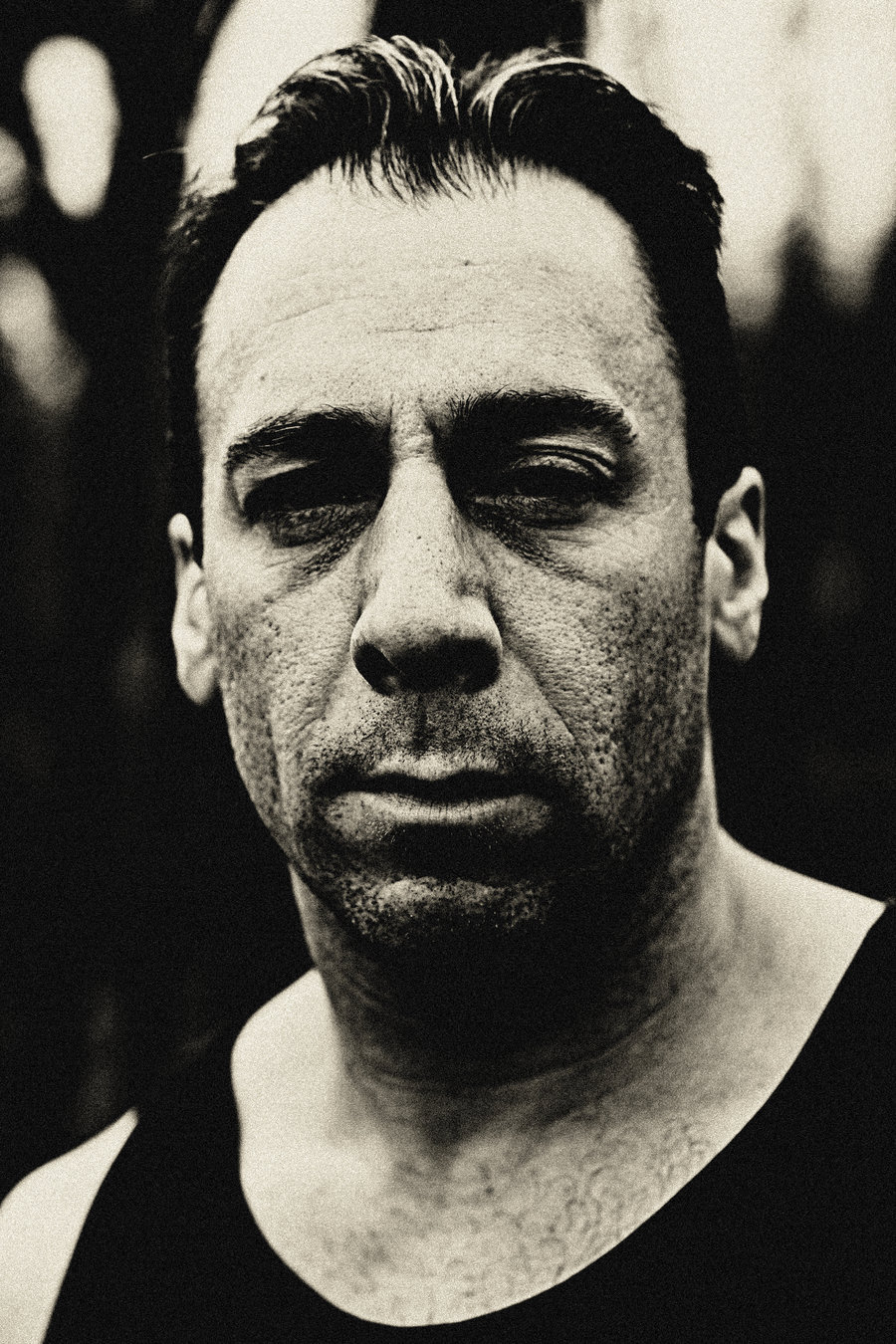
I chose Anton Corbijn  as I want my own images to be in black and white. I'm drawn to his tonal ranges in his images they are slightly high contrast, but still have varied tones throughout. Some of his portraits are close up portraits, personal showing lots of detail. This carries forward my idea for my own images some high contrast black and white images with close up shots of the face and body parts. 

Chuck Close

 
itecube.com/blogs.artinfo.com  17.05.2016

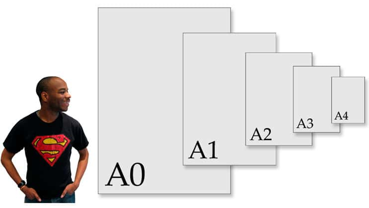
I am really inspired by Chuck Close on the size he displays his work. It is defiantly something I am looking into to display my own work for the final end of year show on a large scale. Going to galleries in London and seeing work in large sizes is something that caught my eye a lot its just the beauty of the image magnified on such a large scale you cant help but be in oar of the images. I don't think I will get my images as big as Chuck's but somewhere along the lines of A0-A2 maybe the one for my own work.